Tag Archives: acrylic paint

Killer Whale?

2 May

Whale 28 has turned out to be more than a Killer Whale, it’s killer gorgeous! With its wide body and the shiny pearl effect, I think Pink Taffeta is the color to use from now on for new whales. So I will go back to Meranti and work on more whales.

Ahhh… fun times ahead!

img_1442

More New Colors

25 Apr

I thought carving up Citizen #182 was significant so I bought new colors to commemorate it. This time, I decided to introduce shiny colors for variety.

So besides painting up Citizen #182 in pearl Taffeta Pink, #183 was also given the new color, the glitter blue. Not content with this, I then refreshed a few earlier Citizens, adding clear glitter on top of their existing colors.

Maybe this year, glitter is the way to go as this latest batch look very pretty and shiny. I like ‘em.

img_1055

img_1460

Picture not giving the gloss and glitter enough prominence

Nothing Goes to Waste, Part 2

26 Nov

When I carve my pieces using Meranti wood, the wood blocks are all at different sizes. As such, I have to cut them to the proportions I want and there’ll be wastage. Hubby felt that it’s such a waste to throw away all those excess odd pieces.

So he experimented with the leftovers, using them as a prop or base for his air plants. And with just coat of acrylic paint, no gesso, they became simple and eye-catching tabletop pieces.

I wonder if the next piece should be a bit more elaborate. Hmm? Well, there’s plenty of wood to fine tune the overall look. From balsa where the odd ends become little Gnomes, and now Meranti as props for air plants certainly nothing goes to waste.

img_5940img_5939

Ciabatta No More, Part 2

22 Nov

A couple of weeks ago, the effort reworking the second Gnome Home sapped me and I left it unattended for days after the first coat of colors. Eventually, despite a gruelling gym session where—in my trainer’s words “She went mental and gave it to us”— we were depleted of strength, I somehow managed to muster some energy to apply the final coat of acrylic to the roof and chimney.

The Fire Engine Red is obviously darker than the Cadmium Red but I think there’s character as well. I think the Gnomes like it.

Now in between mulling another home but a towering one for variation, I carved four phone holder whales, seven Gnomes and a Monument. So much carving to do, so little time.

img_5891

The Gnomes standing proudly in front of the two new Gnome Homes.

The Trophy Owl

6 Aug

A friend recently requested for a white colored Citizen of Gigglesville. Now I have never done a white one as the end result because white is always the base before any colors are added.

But I obliged her for special reasons and voila! I now have what I call the Trophy Owl. This could be the beginning of something new or a whole new category by itself. Hmm…

img_4330

Change of Colors

27 Jul

Out of the blue, I decided to change the colors of two Monuments. I felt the original colors were not contrasting enough. Also the fluorescent green on the smaller Monument was patchy, I didn’t like it.

The new Martha Stewart Granny Smith green color beckoned and lo and behold, I painted it over the fluorescent green. But I couldn’t do the same for the blue on the bigger Monument because there’s green already. So I used Fire Engine red instead.

I like both the Monuments much better now. All they need is just a final gloss varnish for the finishing touch.

img_4318

A New Green, Part 2

12 Jul

I had to try the new Martha Stewart’s Granny Smith green. But there were no new Citizens carved up, so Apeach gave me a hand on this with the platform that it is standing on. A perfect setting to see the glory of the green.

Isn’t it just a lovely and refreshing color? Apeach certainly looks happy.

img_4144

A New Green

9 Jul

Last week, I bought a new green color to add to my acrylic color palette for the Citizens of Gigglesville. I must say I have several shades of green, accumulated throughout the years and more added in recent months.

However, lately I felt the choices that I have are a wee bit too dull and predictable. And some of colors are even too old to be used. The Liquitex brand is most obvious having lost its strength (for lack of a better word) because it does not stick well or smoothly upon application. Then again, even the new Neon Green from Apple Barrel does not do too well on wood and I am not sure why. In essence then, only four shades are used on a rotational basis.

I like the new Martha Stewart Crafts’ Granny Smith green choice for a brighter and more refreshing look to add some zest to the Citizens of Giggglesville. Looking forward to using it soon!

img_4140

Seeing green!

Replenishing the Supplies, Part 2

26 Apr

After much thought, I decided to repaint the two-tier Monument. From its original of being all dark brown, I thought one species being bronze might look more regal. And I think it does.

I then tested on a three-tier Monument. Compared to an earlier piece looking colourful and very playful, the brown/bronze/brown version looks more serious and monumental. At the end of the day, there is no right or wrong to paint all these up.

IMG_3179.jpg

IMG_3178.jpg

New Colors, Part 2

5 Dec

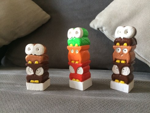
Citizens of Gigglesville are getting new colors! I dropped by the art store over the weekend and bought new colors to expand the range for them. Actually not totally new but more of different shades for the existing red, blue and green for variation. I even picked up a bottle of Glow!

I thought the name of the blue shade is rather funny, Real Blue, as if all these while, the other blues that I am using are fake! Hahaha… it’s a nice dark blue nonetheless. So now, there’s three shades of blue which is good. Variations.

The dark Engine Red is similar to an existing Naphthol Red Deep, but it’s okay because like the blue, the red range now also has three shades.

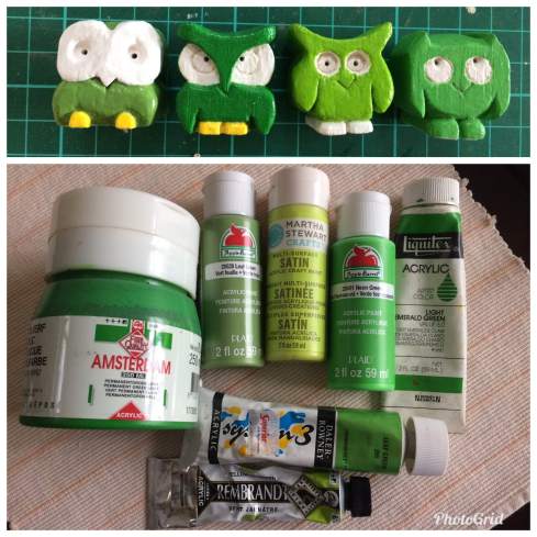
And although the names are the same, the new Leaf Green does not even look close to the old Leaf Green. It is leaning more towards an olive shade while the old is akin to a Granny Smith’s apple green. Like the other two colors, the green range now also has three shades with the new olive addition.

As for the Glow paint, it’s something new to explore. The big debate now is whether to paint just the eyes or the whole body. With balsa being so porous, I’m don’t know how the end result would look. Hmm… got to experiment and see.

IMG_1436.jpg